Research Paper Graph: How to Insert Graphs, Tables & Figures
Graphs are common items in the academic scenario. They are critical in summarizing and displaying data in a way that is easier for the audience to comprehend.
There exist different graphs that researchers use to have varying impacts. These graphs offer an additional explanation of the topic of your research.

If you cannot do this, you can get our essay writers to handle the task. However, read on if you want to know how to do it.
In our guide on how to write a term paper, we gave you various steps to complete a good paper. This piece offers you more insights on how to insert a graph in a research paper.
How to Insert a Graph in a Research Paper
- Open MS Word and choose Insert.
- Label the axis well. For example, you can label the X-axis using the question asked and let the Y-axis have numbers to indicate how many people answered that way.
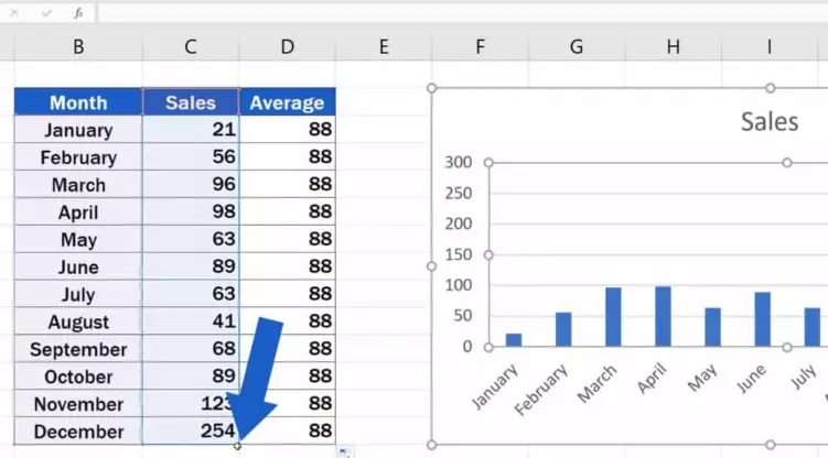
- Insert all the collected data in every corresponding cell in the Excel window.
- Create the graph and place it into the research paper.
- Select the chart and settle with the style that best represents your research.
- Put captions and citations in the research paper.
- Select the graph and paste it into your Word document.
People Also Read: How to Use Personal Experience in Research Paper or Essay
Importance of Graphs and Tables in Research Writing
1. Better Understanding
Some situations prompt us to compare the performance of two scenarios.
The traditional approach involves going through bulky data from both scenarios and later analyzing it, which is time-consuming.
Graphs help the audience to understand your research work easily and more quickly than when represented in figures.
2. Accurate Analysis
Graphs and tables are the only tools that enable the audience to understand and analyze trends easily. They summarize a large amount of data in an easy and interpretable form. Moreover, they help one study and interpret patterns.
3. Easy Sharing of Information
Tables and graphs have a greater role in making your research digestible at visualization. They are perfect avenues to make your research more engaging. At a glance, they will convey the message to the reader instantly.
4. Explores Findings
You will gain in-depth knowledge of the new findings by including tables and graphs in your research. You can use them to understand patterns suppose you are handling business-related concepts.
5. Comparing and Contrasting
It is easier to highlight values with many shared variables and characteristics. As such, it becomes easier in studying patterns and consume the information with ease. They help the audience to understand the data in a comparative state.
6. To Prove a Point
It boosts your understanding when you make tabulated results alongside graphical representation. The reader will easily find the conclusion without understanding the calculations.
People Also Read: Best Research Paper Font and Size: Best Styles for an Essay
Other Alternatives to Graphs in a Research Paper
Tables
A table is a useful tool when you want to show the reader how dependent and independent variables interact. Readers use tables to compare values between groups of related measurements. Tables allow the reader to explore data according to their interest.
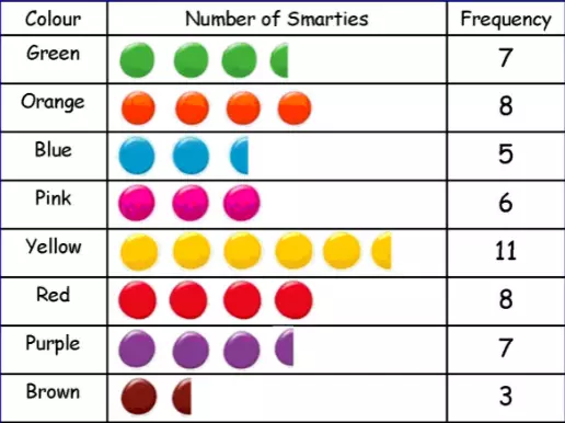
One can create such tables by using the Excel program to represent the data wonderfully.
The table should have a title column title and table body. Furthermore, a table should have a descriptive title to act as the topic of your table.
Depending on the discipline, the title can be lengthy or short.
Besides, the table should have a column title to simplify it. The right set of column titles allows the reader to grasp the content.
Finally, the table body is the main area where we put numerical or textual data. Construct the table so that the elements can be read from up to down.
Once you create the table in the Excel sheet, copy-paste them on the center page of your research paper. More importantly, ensure that you reference it well. Avoid text wrapping in this case. Set your table apart from the text.
Infographics
You can make your research finding more engaging by collecting your data and reporting it in infographics. Before you create an infographic, you should observe the following:
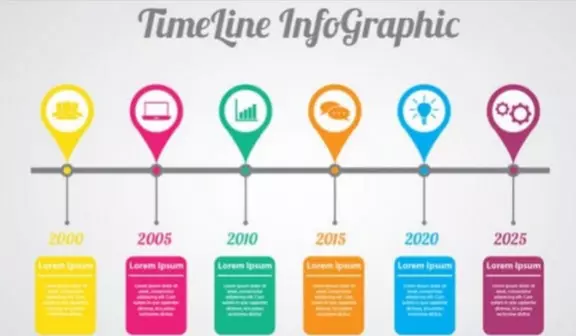
Research
Begin with a good foundation to create effective graphics.
Some infographics rely on data or quantitative research to explain the information.
You can use the data alone when reporting the findings. The included text appears in labels and headings.
Organize the Information
Organize the information into an outline. You can achieve that through word processing depending on your content.
You should have a beginning, middle, and end. The beginning should have an introductory paragraph. The middle should have figures, facts, and content. The end should have a call to action.
Create a Structure
It is time to create an outline and translate it into a professional-looking design. Alternatively, expand an existing outline or choose a new document.
Design the Infograghics
Import the Excel sheets and populate your charts with data directly into the infographic maker. You can select the color palettes, fonts, and icons and move them around the page to your preference.
Refine your work with the right color elements and ensure that you have the correct color that is appealing to your audience.
Inserting the Infograghics
Create an outline that follows the structure of your research paper. As noted before, essays or papers can have charts and infographics, which is definitely in line with the outline.
In addition, fill out the outline using the content, data, or information you referenced in the research paper and present the layout that flows data logically.
Figures
Figures take varying forms such as frequency histograms, bar graphs, maps, and drawings. If you are using the figures in your research paper, it is always important to focus on the reader. Use the easiest figure that your reader will use to understand effortlessly.
You can use the figure to present your data more effectively and efficiently. For example, if you want your reader to understand spatial relationships more efficiently, use photographs. Typically, figures should have the following sections:
- Figure Captions: Your figures should be numbered and have descriptive titles. The captions should be clear enough for the reader to understand at a glance. Ensure that you place the captions under the figure.
- Image: Select an image that is simple and easy to understand. Consider the resolution, size, and overall attractiveness.
- Extra Information: Number the illustrations from the manuscripts separately. You can include any other information in the figure to help the reader understand.
You can create a figure from the Excel sheet and format it appropriately. Label the vital parts well for better interpretation of the data. After that, you can copy-paste it into your research paper to present your finding in an analyzed form.
Charts
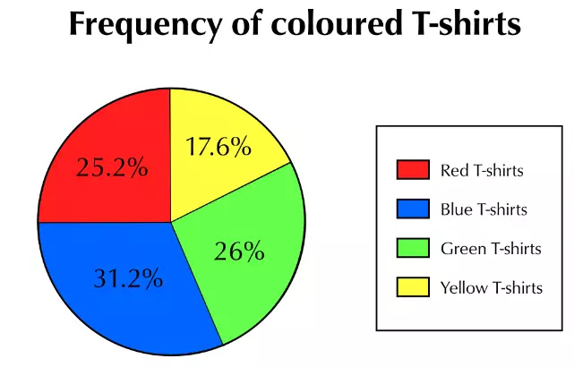
A chart is a graph that features cycles cut into varying sectors. Every sector represents a relative size of value for a whole.
We create charts to represent the quantity proportionally. Furthermore, it can represent many classes of data in a single chart.
The main role of a chart is to place large sums of data in a visual format for better understanding.
In addition, they are more visually appealing than other graphs. Not to forget, a chart offers easy calculation of your data accuracy, making it demand little explanation. As such, different readers can understand it without minimal struggle.
One can create a chart in Excel by doing the following steps:
- Begin by selecting the data that you want to create your chart.
- Choose the insert option and access the recommended charts.
- On the Recommended charts, select your favorite chart and see how it looks.
- Click OK to select it.
- You can format the chart using the given elements in it.
After that, you can copy-paste it into the research paper on an appropriate page for better readers’ interpretation.

When not handling complex essays and academic writing tasks, Josh is busy advising students on how to pass assignments. In spare time, he loves playing football or walking with his dog around the park.